Card Component
From anatomy to production - how Garmin's most versatile component was built, governed, and scaled.
Role: Lead Web Product Designer
Company: Garmin
Scope: Global Design System

The Building Block Behind Everything
The card is Garmin's most used and most versatile component. It works as a standalone unit, nests inside the card rail, and plugs into other content models like lego bricks. But behind its simplicity is a deeply considered anatomy -- image ratios, content hierarchy, CTA behavior, responsive breakpoints, accessibility states, and content model compatibility in Contentful. This is the story of how one component goes from problem to production, and why getting it right matters at global scale.
The Problem
Cards were being built inconsistently across garmin.com. Different teams were making different decisions about image ratios, text truncation, CTA placement, and responsive behavior -- resulting in a fragmented experience for users and duplicated effort for designers and developers. There was no single source of truth for what a card was, what it could do, or how it should behave.
My Role
Lead Web Product Designer. I led the card component from initial problem definition through DS vetting, anatomy documentation, variant design, technical vetting, Storybook handoff, Contentful content model integration, and production deployment. The card is now the most used component in the Garmin global design system.
The Anatomy
Every decision in the card component is intentional. The anatomy breaks down into four primary zones:

Image zone: Supports multiple aspect ratios -- 16:9, 4:3, and 1:1 -- with defined behavior for missing or loading images. Alt text required for all instances.

Content zone: Headline, body copy, and optional eyebrow label. Strict character limits enforced to prevent layout breaking across responsive breakpoints.

CTA zone: Single primary CTA with optional secondary. Button style inherits from the global DS button component -- no one-off styling permitted.

Container zone: Responsive behavior defined at four breakpoints. Corner radius, padding, and border treatment standardized across all variants.
In Production Supporting Examples

Card in a product grid
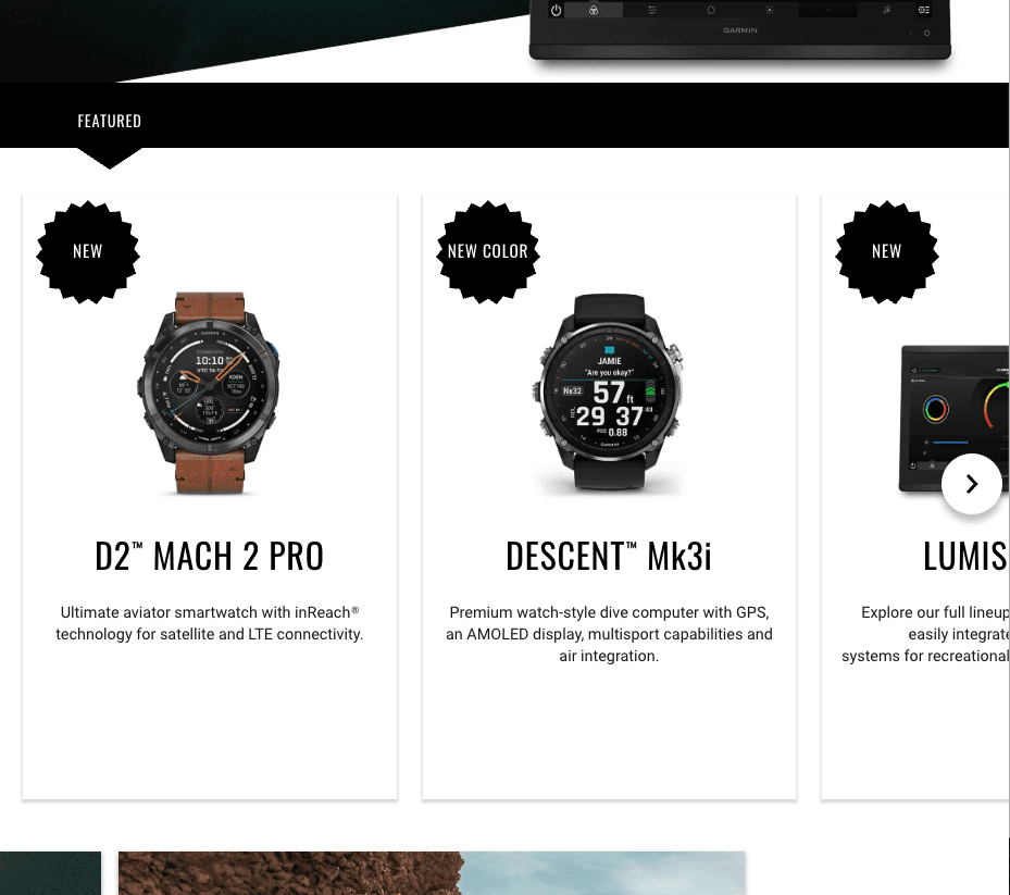
Card inside the card rail
Card Component
From anatomy to production - how Garmin's most versatile component was built, governed, and scaled.
Role: Lead Web Product Designer / Company: Garmin / Scope: Global Design System
The Building Block Behind Everything
The card is Garmin's most used and most versatile component. It works as a standalone unit, nests inside the card rail, and plugs into other content models like lego bricks. But behind its simplicity is a deeply considered anatomy -- image ratios, content hierarchy, CTA behavior, responsive breakpoints, accessibility states, and content model compatibility in Contentful. This is the story of how one component goes from problem to production, and why getting it right matters at global scale.
The Problem
Cards were being built inconsistently across garmin.com. Different teams were making different decisions about image ratios, text truncation, CTA placement, and responsive behavior -- resulting in a fragmented experience for users and duplicated effort for designers and developers. There was no single source of truth for what a card was, what it could do, or how it should behave.
My Role
Lead Web Product Designer. I led the card component from initial problem definition through DS vetting, anatomy documentation, variant design, technical vetting, Storybook handoff, Contentful content model integration, and production deployment. The card is now the most used component in the Garmin global design system.
The Anatomy
Every decision in the card component is intentional. The anatomy breaks down into four primary zones:
Image zone: Supports multiple aspect ratios -- 16:9, 4:3, and 1:1 -- with defined behavior for missing or loading images. Alt text required for all instances.
Content zone: Headline, body copy, and optional eyebrow label. Strict character limits enforced to prevent layout breaking across responsive breakpoints.
CTA zone: Single primary CTA with optional secondary. Button style inherits from the global DS button component -- no one-off styling permitted.
Container zone: Responsive behavior defined at four breakpoints. Corner radius, padding, and border treatment standardized across all variants.
The card is Garmin's most used and most versatile component. It works as a standalone unit, nests inside the card rail, and plugs into other content models like lego bricks. But behind its simplicity is a deeply considered anatomy -- image ratios, content hierarchy, CTA behavior, responsive breakpoints, accessibility states, and content model compatibility in Contentful. This is the story of how one component goes from problem to production, and why getting it right matters at global scale.
The Building Block Behind Everything
In Production Supporting Examples
Card in a product grid
Card inside the card rail

Standalone card

Top Navigation Card
The Problem
Cards were being built inconsistently across garmin.com. Different teams were making different decisions about image ratios, text truncation, CTA placement, and responsive behavior -- resulting in a fragmented experience for users and duplicated effort for designers and developers. There was no single source of truth for what a card was, what it could do, or how it should behave.
My Role
Lead Web Product Designer. I led the card component from initial problem definition through DS vetting, anatomy documentation, variant design, technical vetting, Storybook handoff, Contentful content model integration, and production deployment. The card is now the most used component in the Garmin global design system.
The Anatomy
Every decision in the card component is intentional. The anatomy breaks down into four primary zones:
Image zone: Supports multiple aspect ratios -- 16:9, 4:3, and 1:1 -- with defined behavior for missing or loading images. Alt text required for all instances.
Content zone: Headline, body copy, and optional eyebrow label. Strict character limits enforced to prevent layout breaking across responsive breakpoints.
CTA zone: Single primary CTA with optional secondary. Button style inherits from the global DS button component -- no one-off styling permitted.
Container zone: Responsive behavior defined at four breakpoints. Corner radius, padding, and border treatment standardized across all variants.
Standalone card
The Governance Process
The card component moved through all four stages of the DS governance workflow before reaching production.
The card doesn't live in isolation. It composes into larger patterns across garmin.com -- most notably the card rail, where multiple cards are arranged horizontally with optional filtering and a section-level CTA. This composability is what makes the card foundational rather than just useful.
The card component moved through all four stages of the DS governance workflow before reaching production.
The card doesn't live in isolation. It composes into larger patterns across garmin.com - most notably the card rail, where multiple cards are arranged horizontally with optional filtering and a section-level CTA. This composability is what makes the card foundational rather than just useful.
Top Navigation Card


The Outcome
The card component is now the most used building block in Garmin's global design system. It ships consistently across 41 countries and 25 languages, serves multiple content types without custom styling, and composites into larger patterns that power some of garmin.com's most visited pages. One component, governed well, scales everywhere.
The Governance Process
The card component moved through all four stages of the DS governance workflow before reaching production.
The card doesn't live in isolation. It composes into larger patterns across garmin.com -- most notably the card rail, where multiple cards are arranged horizontally with optional filtering and a section-level CTA. This composability is what makes the card foundational rather than just useful.
The Outcome
The card component is now the most used building block in Garmin's global design system. It ships consistently across 41 countries and 25 languages, serves multiple content types without custom styling, and composites into larger patterns that power some of garmin.com's most visited pages. One component, governed well, scales everywhere.